Correlation in the COVID-19 cases and deaths depending on the delay. Part 1.
By Michal Deak.
(¿No sabes inglés? Botón derecho del ratón -> Traducir)
Pandemic motivates
The COVID-19 pandemic might be soon over. One can surely say, that the novel coronavirus – SARS-Cov-2 – changed lives of overwhelming majority of people around the globe. In the time we live in there is no shortage of more or less reliable information available around the internet. The numbers of newly infected people, recovered people and deceased people are presented on news and specially dedicated webpages. One should be able to make a concise picture for themselves and come to a conclusion about severity of the situation and the dangerousness of the COVID-19 disease.
There are many questions, that one can ask that are already answered out there, but getting in touch with the data and get some answers by oneself provides so much more satisfaction and can give greater insight. There are always plots one finds missing from even the most thorough analysis found on internet. That is why I went on a short time obsessive streak to find out answers to some of my questions about the ongoing pandemic. That and I wanted to learn some R programming and try some data analysis – to try to work on an interesting project.
So, what can one deduce from the data publicly available online? Let us find out, we might learn more on the way there.
How much time do I have, Doc?
Patient: How much time do I have, Doc?
Doctor: 10…
Patient: What 10? 10 weeks? 10 months?
Doctor: … 9, 8, 7…
There is actually information about the average time TD it takes for a patient to die from COVID-19 – time from infection to death – out there. Most sources give TD = 18.5 days [1]. Intuitively, information about TD should be encoded in the correlation between new daily cases and new daily deaths data. The more cases one day the more deaths on someday in the future.
The answer we might get from the publicly available data might differ from the measured TD since the value we calculate is not calculated directly. We shall not use information about every single patient. We are going to use information about daily new SARS-Cov-2 cases and daily new casualties – easily obtainable information available online. Specifically, for our analysis we are going to use data from worldometeres.info [2]. The discrepancies between our results might come from data collection issues like delays between infection date and test date for a patient – especially in early days of the pandemic the patients were tested mostly when they had severe symptoms – and delay in the death date and date when the death is declared as caused by COVID-19 or other nuanced problems related to relatively complicated data collection process.
Without further ado, let us dive into the data.
Looking at the data
We have scraped the data from worldometeres.info [2] using the waybackmachine [3] and the wayback-machine-scraper [4]. The scraped data includes information from March 23rd 2020 till September 15th 2020. Since every country is specific in its dealing with the epidemic/pandemic we should first focus on one country and since United States are rich on this kind of data we shall focus on US this time, although it will be interesting to compare data from various countries and we might (I promise we shall) look at that in later studies.


Figure 1: New SARS-Cov-2 daily cases (left). New SARS-Cov-2 daily deaths (right)
Now that we have the data let us make a plot. More specifically let us make a plot of the new SARS-Cov-2 cases (Fig. 1) with the new SARS-Cov-2 caused death cases (Fig. 1). In Fig. 3 you can see, that the data points form blobs and the linear regression fit does not provide good description of the data. Not much correlation there.
You can also see, that we have separated the data points into 3 groups. We have chosen these 3 groups to separate the different pandemic waves. As you probably know there are “unofficially” 2 pandemic waves, but we have 3 groups. As it will turn out later this separation is useful. As the legend of the plot in Fig. 1 suggests red dots represent the 1st wave – data from the April 4th till June 11th 2020. Green dots represent the 2nd wave – data from June 12th till Ocober 15th 2020. Blue dots represent data from March 23rd till April 3rd 2020. Note: the separation between the 1st and 2nd wave has a certain degree of arbitrariness. Basically, the division point can be chosen from any of the points in the region in the plot in Fig. 2 where the green and red blobs overlap.
We have mentioned, that there is not much correlation in the plot in Fig. 1. One explanation could be, that we should not expect much expectation anyway, because it takes some time for a new case of SARS-Cov-2 to result in a death case, so, we should actually be correlating the new cases with death cases from the future (from the new case point of view). We can do that by introducing a delay into the correlation calculation. But what value of delay to introduce, you ask yourself.
Well, why not to introduce bunch of values of the delay and see which one is the best. Of course, it should be done for the 1st and 2nd wave separately. And voilà, we can see the results in the plot in Fig. 3. From the first glance at the just mentioned plots we realize, that our straightforward approach will not work. We can see, that the delay correlation spectrum contains multiple peaks, each separated by the next one by 7 days. Looking back on the new daily cases and new daily deaths plots (Fig. 1), which both contain multiple peaks with 7 days periodicity, we should have expected this behavior.

Figure 2: Correlation plot of new SARS-Cov-2 cases to new SARS-Cov-2 death cases with no delay and no averaging.


Figure 3: Correlation of new SARS-Cov-2 cases and new SARS-Cov-2 deaths as a function of delay during the 1st (up) and 2nd (down) pandemic waves.
Now we stand in front of few question: Is one of the peaks the right one or should we filter out the 7 days cycle from our plots?
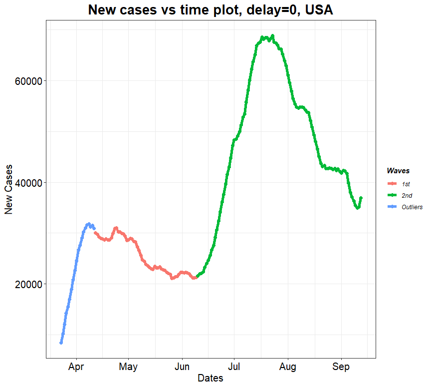

Figure 4: New SARS-Cov-2 daily cases (left) and daily deaths (right) averaged over 7 days.
The usual way to get rid of the 7 days cycle is to instead taking daily case and deaths to use the 7 days moving average for both (Figs. 4). (Another approach could be to fit the points in Figs. 3 by a modulated oscillating function and find the maximum of the unmodulated function. We have done both and the results are consistent with each other.) Well, adopting the 7 days moving average method turns out beautifully. When we look at the correlation of the two quantities as a function of the delay now in Fig. 5, we can see curves with more or less defined maxima.
The correlation for the 1st wave in Fig. 5 peaks at around delay equal to 9 at the value 0.95 and the correlation for the 2nd wave in Fig. 5 peaks at around delay equal to 17 at the value 0.98. The peak in the delay plot for the 2nd wave is pretty well defined compared to the one in the 1st wave plot. It indicates, that the measurement of the delay of the delay in this way is more precise for the 2nd wave than 1st wave. There is more uncertainty in determining the delay for the 1st wave – the spread of the values is wider. Now we can plot correlation plots by including the obtained delays. Looking at plots in Figs. 6, it is actually surprising how well it works. Especially the second wave data stack up almost perfectly on a line.
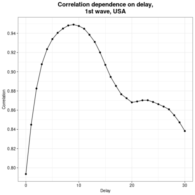
Figure 5: Correlation of new SARS-Cov-2 cases and new SARS-Cov-2 deaths as a function of delay during the 1st (left) and 2nd (right) pandemic waves. Averaging over 7 days.
(Article continues in part 2)